Back

/

Leena AI

Unified Analytics Dashboard

Unified Analytics Dashboard

Bringing scattered insights together in one powerful dashboard

Bringing scattered insights together in one powerful dashboard

Leena AI's analytics lived across separate modules HR, bot performance, tickets, agent metrics forcing teams to jump between dashboards to answer one question. I owned the end-to-end redesign: research, IA, design, and handoff turning eight fragmented dashboards into one cohesive system.

Leena AI's analytics lived across separate modules HR, bot performance, tickets, agent metrics forcing teams to jump between dashboards to answer one question. I owned the end-to-end redesign: research, IA, design, and handoff turning eight fragmented dashboards into one cohesive system.

ROLE

Lead Product Designer

Lead Product Designer

TEAM

1 Designer, 1 PM, 2 Engineers

1 Designer, 1 PM, 2 Engineers

DURATION

2 Months

2 Months

RESULTS

Time to insights: ~5 days to Real-time access
Bot improvement cycles: Monthly to Weekly
SLA visibility: Manual/Excel to Customised report
Feature prioritisation: Reactive to Data-driven

Time to insights: ~5 days to Real-time access
Bot improvement cycles: Monthly to Weekly
SLA visibility: Manual/Excel to Customised report
Feature prioritisation: Reactive to Data-driven

Why this mattered

Every team had data. Nobody could read it together.

  • 38% struggled to find what they needed.

  • 43% said data representation was unclear.

  • 32% had no way to compare or act on reports.

"I just want one place to see everything." "Each module feels like its own world."

Every team had data. Nobody could read it together.

  • 38% struggled to find what they needed.

  • 43% said data representation was unclear.

  • 32% had no way to compare or act on reports.

"I just want one place to see everything." "Each module feels like its own world."

The Problem

Eight dashboards, built independently, with no shared logic.

Area

What was broken

Navigation

Every module had its own layout switching felt like a different product

Filters

Didn't persist across dashboards, breaking decision flow

Benchmarks

No way to compare data, numbers had no context

Roles

Same view for HR, Support Ops, and Leadership served nobody well

This wasn’t a visual polish problem. Eight separate dashboards built for eight separate jobs, with no shared logic connecting them.

Eight dashboards, built independently, with no shared logic.

Area

What was broken

Navigation

Every module had its own layout switching felt like a different product

Filters

Didn't persist across dashboards, breaking decision flow

Benchmarks

No way to compare data, numbers had no context

Roles

Same view for HR, Support Ops, and Leadership served nobody well

This wasn’t a visual polish problem. Eight separate dashboards built for eight separate jobs, with no shared logic connecting them.

Research Summary

Stakeholder interviews, journey mapping, and a competitive review of Culture Amp, Tableau, and Pendo to separate what people said they wanted from what was actually slowing them down.

Persona

Core job

What research changed

HR Admin / VP

Org health at a glance

Needed a single overview, not module-hopping

Support Ops

Ticket and SLA tracking

Needed role-scoped views, not shared dashboards

Analytics / PM

Bot and session performance

Needed comparative benchmarks, not raw numbers

The biggest reframe: the problem wasn't missing data it was that the same data meant different things per role, and the product treated everyone the same.

Stakeholder interviews, journey mapping, and a competitive review of Culture Amp, Tableau, and Pendo to separate what people said they wanted from what was actually slowing them down.

Persona

Core job

What research changed

HR Admin / VP

Org health at a glance

Needed a single overview, not module-hopping

Support Ops

Ticket and SLA tracking

Needed role-scoped views, not shared dashboards

Analytics / PM

Bot and session performance

Needed comparative benchmarks, not raw numbers

The biggest reframe: the problem wasn't missing data it was that the same data meant different things per role, and the product treated everyone the same.

How Research Shaped the Interface

Design Decision: One System, Eight Dashboards Not Eight Separate Products. Three principles ran through every decision:

  • Modular every metric is a card or module; dashboards assembled from the same building blocks, not rebuilt from scratch each time.

  • One visual language shared chart library, consistent color logic (blue = required, red = at risk), unified typography across all eight views.

  • Comparative by default benchmarks on every view, not as an advanced feature, because context is what turns a number into a decision.

Design Decision: One System, Eight Dashboards Not Eight Separate Products. Three principles ran through every decision:

  • Modular every metric is a card or module; dashboards assembled from the same building blocks, not rebuilt from scratch each time.

  • One visual language shared chart library, consistent color logic (blue = required, red = at risk), unified typography across all eight views.

  • Comparative by default benchmarks on every view, not as an advanced feature, because context is what turns a number into a decision.

1. Overview Dashboard High-level snapshot new, engaged, and churned users; acquisition stats; active users over time. The anchor for every other view.

2. User Metrics User behaviors, acquisition patterns, demographic segmentation. Improved targeting for feature decisions based on real segment data.

3. Bot Metrics Bot responses, thumbs up/down feedback, response time by channel. NLU smart comments alongside usage heatmaps for quick diagnosis.

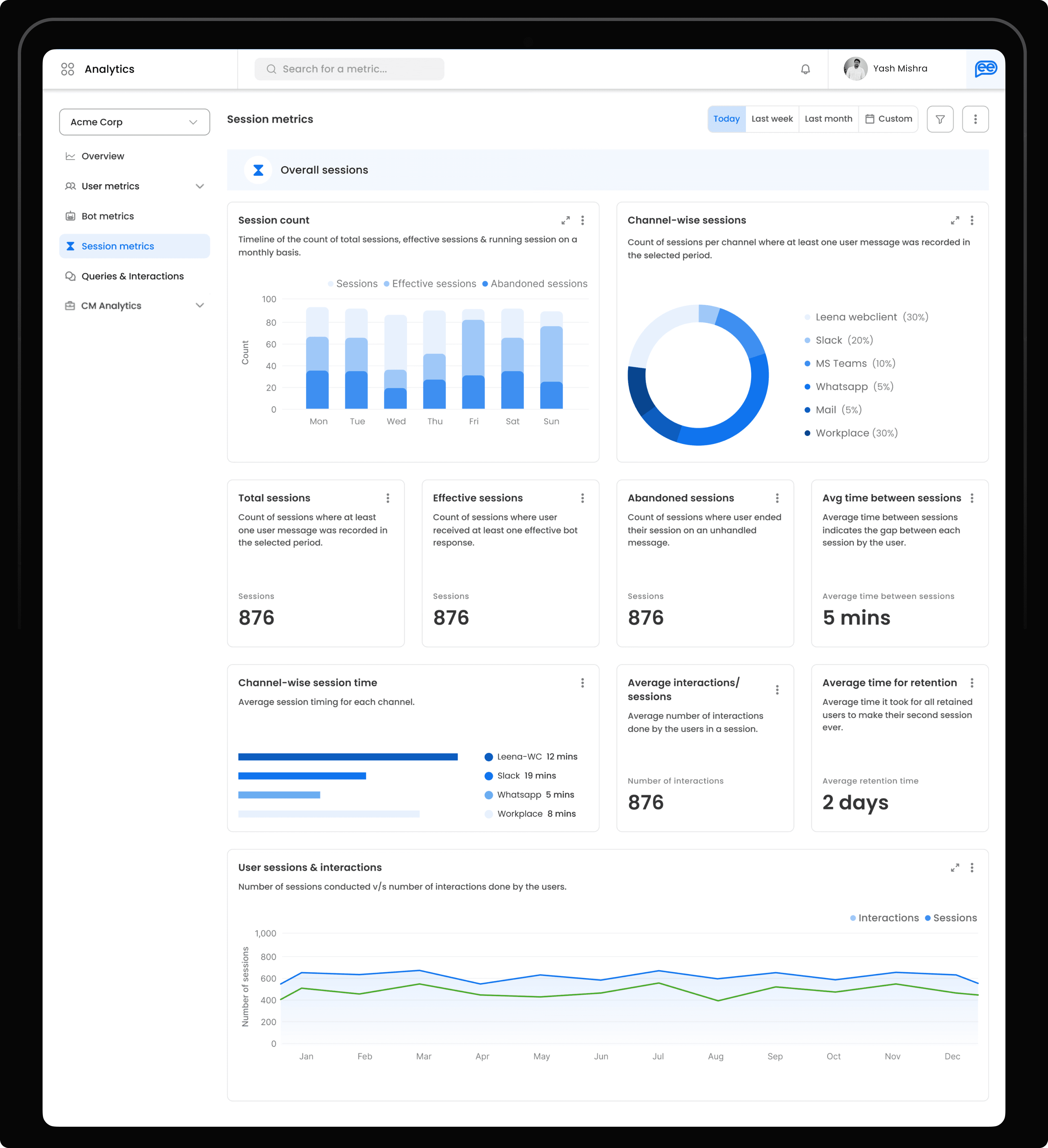
4. Session Metrics Session time, interaction rate, session count. Timeline graphs for evolution; clear separation between sessions and queries to isolate drop-off causes.
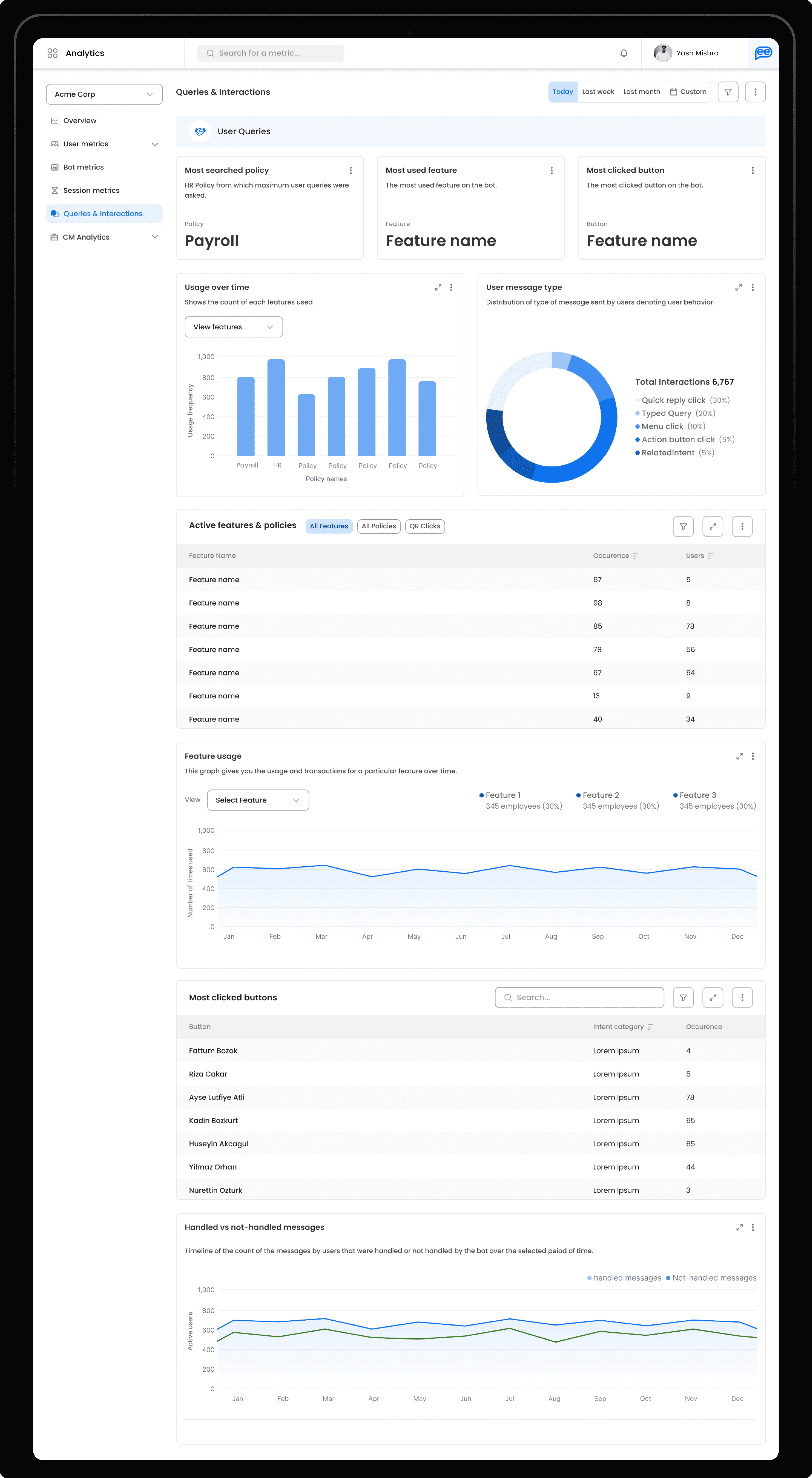
5. Queries & Interactions What users are asking, how they interact, feature usage patterns. Focused on intent mining to continuously improve bot flows.
6. Ticket Volume Trend Ticket backlog by status, channel, hour, and priority. Real-time visibility so agents can be allocated before queues build.

7. CM Performance Resolution efficiency and SLA adherence — color-coded graphs, rating breakdown, multi-layered SLA compliance tracking.

8. Agent Performance Individual agents across the ticket lifecycle. Pagination, filters, and performance highlights optimised for large-dataset scanning.

Testing the Assumptions
  • Co-design workshop with PM and engineers to validate widget approach against the real data pipeline before any Figma work started

  • Visual heatmap testing on the nav layout confirmed right-panel over top-nav freed up meaningful data space

  • Changed based on testing: simplified filter states, added default benchmarks on every view after users couldn't interpret numbers without context

  • Co-design workshop with PM and engineers to validate widget approach against the real data pipeline before any Figma work started

  • Visual heatmap testing on the nav layout confirmed right-panel over top-nav freed up meaningful data space

  • Changed based on testing: simplified filter states, added default benchmarks on every view after users couldn't interpret numbers without context

Results & Impact

Metric

Before

After

Time to insights

~5 days (via engineer)

Real-time access

Bot improvement cycles

Monthly

Weekly

SLA compliance visibility

Manual / Excel

Customised report

Feature request prioritisation

Reactive

Data-driven

Metric

Before

After

Time to insights

~5 days (via engineer)

Real-time access

Bot improvement cycles

Monthly

Weekly

SLA compliance visibility

Manual / Excel

Customised report

Feature request prioritisation

Reactive

Data-driven

Retrospective
  • One size doesn't fit all but one language can. HR and Support Ops needed different KPIs; they could still share the same visual logic. Consistency across eight dashboards meant switching views never required re-learning.

  • Comparative views did more for adoption than any single chart. Once users could benchmark against last month or another team, numbers stopped being abstract and started driving decisions.

  • Visual performance grading works. Color-coded status on every chart not just alert banners meant problems were visible before anyone had to interpret a number.

  • One size doesn't fit all but one language can. HR and Support Ops needed different KPIs; they could still share the same visual logic. Consistency across eight dashboards meant switching views never required re-learning.

  • Comparative views did more for adoption than any single chart. Once users could benchmark against last month or another team, numbers stopped being abstract and started driving decisions.

  • Visual performance grading works. Color-coded status on every chart not just alert banners meant problems were visible before anyone had to interpret a number.