
Back

Analytics Component UI Library

The secret sauce behind faster, consistent chart design.

Working on a new dashboard and realizing you've drawn that same donut chart three times, each slightly different -- that's what pushed me to build this. Without a shared library, every new screen introduced small inconsistencies that slowed down design requests and confused developers trying to build from inconsistent specs.

Working on a new dashboard and realizing you've drawn that same donut chart three times, each slightly different -- that's what pushed me to build this. Without a shared library, every new screen introduced small inconsistencies that slowed down design requests and confused developers trying to build from inconsistent specs.

Working on a new dashboard and realizing you've drawn that same donut chart three times, each slightly different -- that's what pushed me to build this. Without a shared library, every new screen introduced small inconsistencies that slowed down design requests and confused developers trying to build from inconsistent specs.

ROLE

Lead Product Designer

Lead Product Designer

TEAM

1 Designer, 1 Engineers

1 Designer, 1 Engineers

DURATION

1 Month

1 Month

RESULTS

  • ~5x faster design cycles

  • ~80% fewer design inconsistencies

  • New chart types drop in without breaking the system

  • ~5x faster design cycles

  • ~80% fewer design inconsistencies

  • New chart types drop in without breaking the system

Why this mattered

Chart consistency matters in ways users can't always articulate. When the same metric looks different on two screens, trust erodes before anyone files a complaint. Rather than patching dashboards one at a time, I built a shared system from scratch.

Chart consistency matters in ways users can't always articulate. When the same metric looks different on two screens, trust erodes before anyone files a complaint. Rather than patching dashboards one at a time, I built a shared system from scratch.

The Problem

Every new dashboard was rebuilding what already existed, just slightly differently.

  • Same chart types existed in 3+ versions with no shared logic

  • Color, spacing, and empty states differed across modules

  • Developers got inconsistent specs -- each designer named things their own way

  • No guidance on which chart to use and when

The charts existed. The logic connecting them didn't.

Every new dashboard was rebuilding what already existed, just slightly differently.

  • Same chart types existed in 3+ versions with no shared logic

  • Color, spacing, and empty states differed across modules

  • Developers got inconsistent specs -- each designer named things their own way

  • No guidance on which chart to use and when

The charts existed. The logic connecting them didn't.

How Research Shaped the Interface

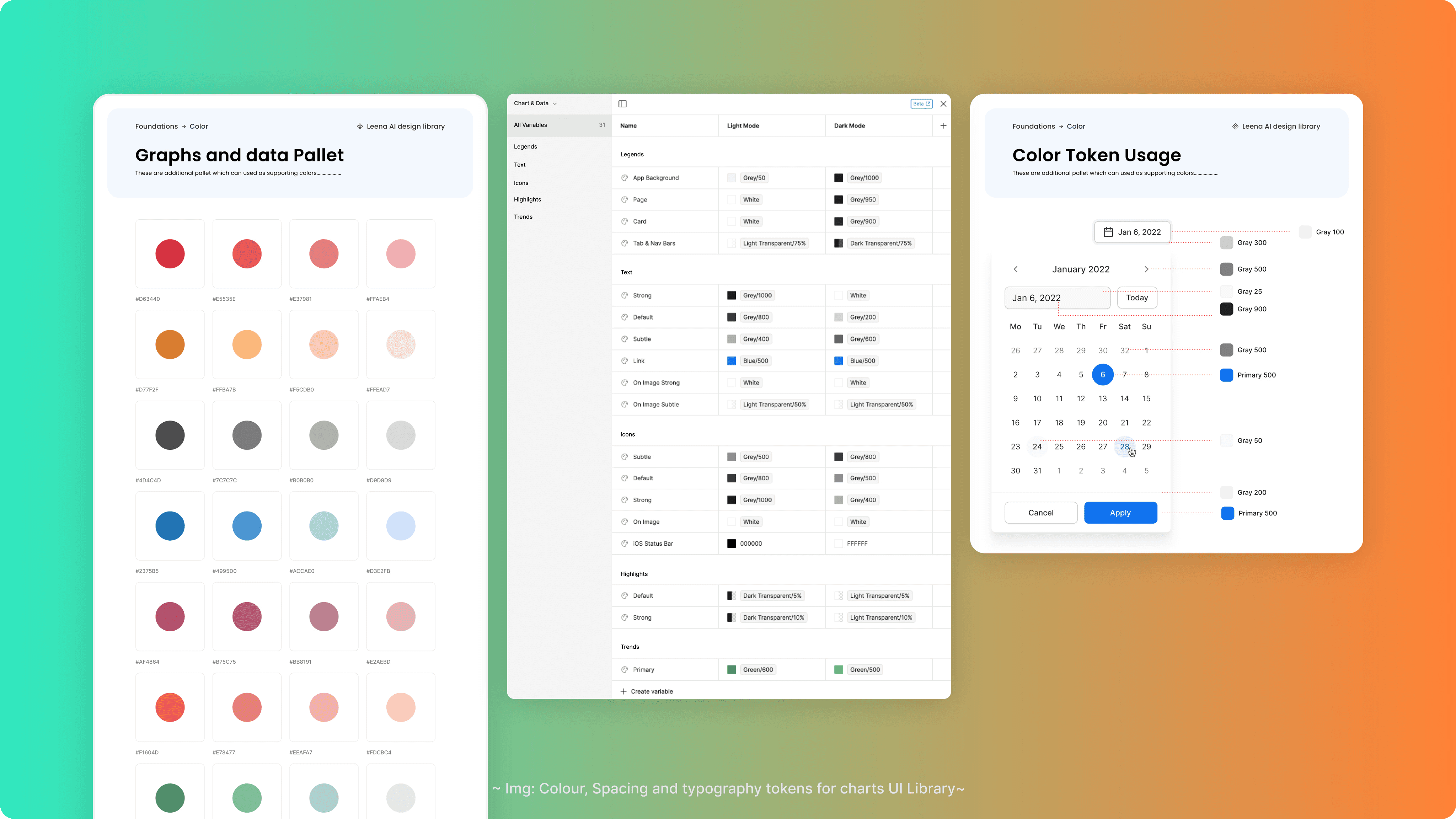
The foundation was simple: atoms first, then components, then dashboards. Legends, scales, gridlines. Then charts. Then cards. Then full dashboards assembled from the same pieces every time.

The foundation was simple: atoms first, then components, then dashboards. Legends, scales, gridlines. Then charts. Then cards. Then full dashboards assembled from the same pieces every time.

8 core chart types: Horizontal Bar, Stacked Bar, Comparison Bar, Comparison Donut, Area, Line, Funnel, Donut.

Each one: auto-layout, responsive resizing, tokenized color logic, consistent tooltips, and empty states ready to drop into any dashboard.

Modular cards ranged from compact KPI tiles to full-width views, all from the same base component, so switching context didn't break anything.

4. Session Metrics Session time, interaction rate, session count. Timeline graphs for evolution; clear separation between sessions and queries to isolate drop-off causes.

For handoff: naming conventions match what engineers call things in code, every state is documented, and chart usage guidelines tell teams which chart to reach for. Because a library that designers and developers name differently is really just two libraries.
Results & Impact

Metric

Change

Design cycles

~5x faster

Design inconsistencies

~80% reduction

Handoff clarity

One shared naming system

Adding new charts

Drop-in, no rework needed

Metric

Change

Design cycles

~5x faster

Design inconsistencies

~80% reduction

Handoff clarity

One shared naming system

Adding new charts

Drop-in, no rework needed

Retrospective
  • Naming and documentation mattered more than I expected. A well-designed component nobody can find or describe consistently is just organised clutter.

  • What started as a one-week sprint became the foundation everything else was built on. Design and development moved faster not because we worked harder, but because we stopped making the same decisions twice.

  • Naming and documentation mattered more than I expected. A well-designed component nobody can find or describe consistently is just organised clutter.

  • What started as a one-week sprint became the foundation everything else was built on. Design and development moved faster not because we worked harder, but because we stopped making the same decisions twice.